seaborn.JointGrid
class seaborn.JointGrid(x, y, data=None, height=6, ratio=5, space=0.2, dropna=True, xlim=None, ylim=None, size=None)
Grid for drawing a bivariate plot with marginal univariate plots.
__init__(x, y, data=None, height=6, ratio=5, space=0.2, dropna=True, xlim=None, ylim=None, size=None)
Set up the grid of subplots.
参数:x, y:strings or vectors
Data or names of variables in
data.
data:DataFrame, optional
DataFrame when
xandyare variable names.
height:numeric
Size of each side of the figure in inches (it will be square).
ratio:numeric
Ratio of joint axes size to marginal axes height.
space:numeric, optional
Space between the joint and marginal axes
dropna:bool, optional
If True, remove observations that are missing from <cite>x</cite> and <cite>y</cite>.
{x, y}lim:two-tuples, optional
Axis limits to set before plotting.
See also
High-level interface for drawing bivariate plots with several different default plot kinds.
Examples
Initialize the figure but don’t draw any plots onto it:
>>> import seaborn as sns; sns.set(style="ticks", color_codes=True)
>>> tips = sns.load_dataset("tips")
>>> g = sns.JointGrid(x="total_bill", y="tip", data=tips)
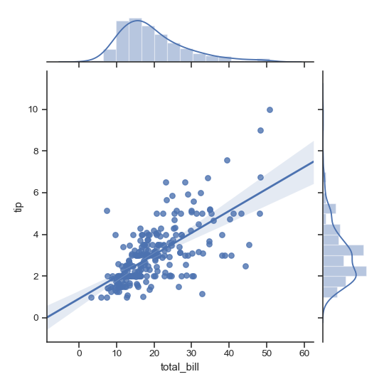
Add plots using default parameters:
>>> g = sns.JointGrid(x="total_bill", y="tip", data=tips)
>>> g = g.plot(sns.regplot, sns.distplot)
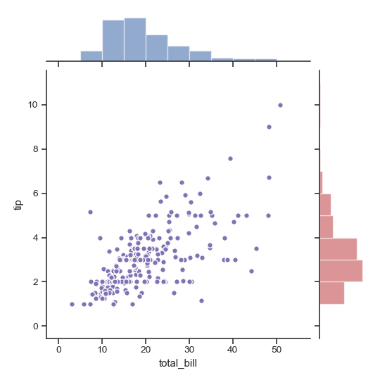
Draw the join and marginal plots separately, which allows finer-level control other parameters:
>>> import matplotlib.pyplot as plt
>>> g = sns.JointGrid(x="total_bill", y="tip", data=tips)
>>> g = g.plot_joint(plt.scatter, color=".5", edgecolor="white")
>>> g = g.plot_marginals(sns.distplot, kde=False, color=".5")

Draw the two marginal plots separately:
>>> import numpy as np
>>> g = sns.JointGrid(x="total_bill", y="tip", data=tips)
>>> g = g.plot_joint(plt.scatter, color="m", edgecolor="white")
>>> _ = g.ax_marg_x.hist(tips["total_bill"], color="b", alpha=.6,
...                      bins=np.arange(0, 60, 5))
>>> _ = g.ax_marg_y.hist(tips["tip"], color="r", alpha=.6,
...                      orientation="horizontal",
...                      bins=np.arange(0, 12, 1))
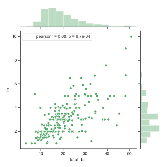
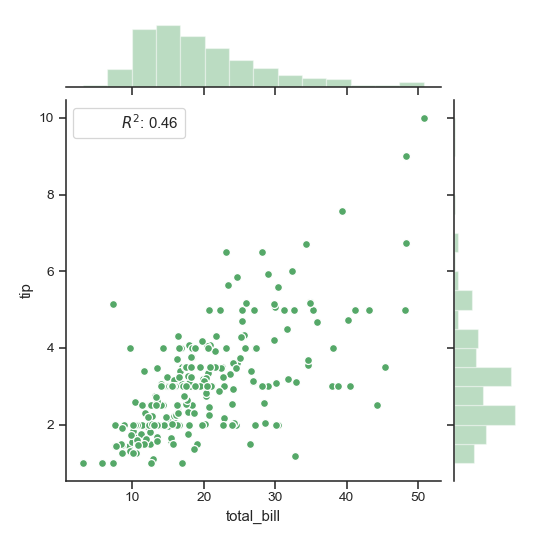
Add an annotation with a statistic summarizing the bivariate relationship:
>>> from scipy import stats
>>> g = sns.JointGrid(x="total_bill", y="tip", data=tips)
>>> g = g.plot_joint(plt.scatter,
...                  color="g", s=40, edgecolor="white")
>>> g = g.plot_marginals(sns.distplot, kde=False, color="g")
>>> g = g.annotate(stats.pearsonr)
Use a custom function and formatting for the annotation
>>> g = sns.JointGrid(x="total_bill", y="tip", data=tips)
>>> g = g.plot_joint(plt.scatter,
...                  color="g", s=40, edgecolor="white")
>>> g = g.plot_marginals(sns.distplot, kde=False, color="g")
>>> rsquare = lambda a, b: stats.pearsonr(a, b)[0] ** 2
>>> g = g.annotate(rsquare, template="{stat}: {val:.2f}",
...                stat="$R^2$", loc="upper left", fontsize=12)
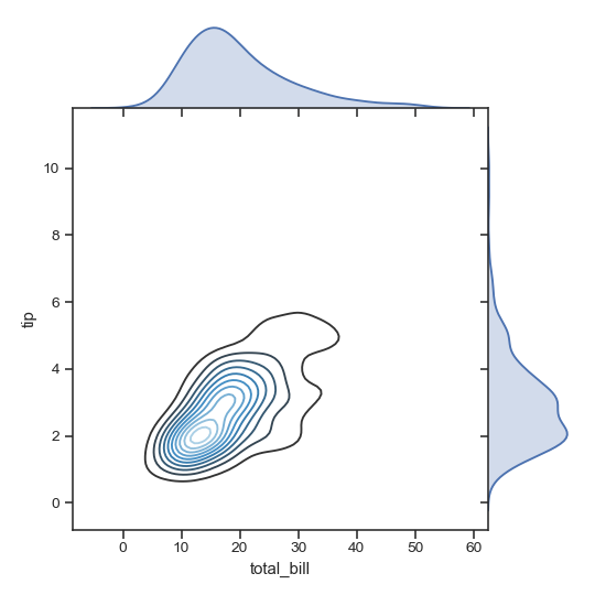
Remove the space between the joint and marginal axes:
>>> g = sns.JointGrid(x="total_bill", y="tip", data=tips, space=0)
>>> g = g.plot_joint(sns.kdeplot, cmap="Blues_d")
>>> g = g.plot_marginals(sns.kdeplot, shade=True)
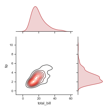
Draw a smaller plot with relatively larger marginal axes:
>>> g = sns.JointGrid(x="total_bill", y="tip", data=tips,
...                   height=5, ratio=2)
>>> g = g.plot_joint(sns.kdeplot, cmap="Reds_d")
>>> g = g.plot_marginals(sns.kdeplot, color="r", shade=True)
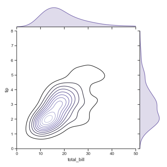
Set limits on the axes:
>>> g = sns.JointGrid(x="total_bill", y="tip", data=tips,
...                   xlim=(0, 50), ylim=(0, 8))
>>> g = g.plot_joint(sns.kdeplot, cmap="Purples_d")
>>> g = g.plot_marginals(sns.kdeplot, color="m", shade=True)
Methods
| __init__(x, y[, data, height, ratio, space, …]) | Set up the grid of subplots. | | annotate(func[, template, stat, loc]) | Annotate the plot with a statistic about the relationship. | | plot(joint_func, marginal_func[, annot_func]) | Shortcut to draw the full plot. | | plot_joint(func, **kwargs) | Draw a bivariate plot of <cite>x</cite> and <cite>y</cite>. | | plot_marginals(func, **kwargs) | Draw univariate plots for <cite>x</cite> and <cite>y</cite> separately. | | savefig(*args, **kwargs) | Wrap figure.savefig defaulting to tight bounding box. | | set_axis_labels([xlabel, ylabel]) | Set the axis labels on the bivariate axes. |